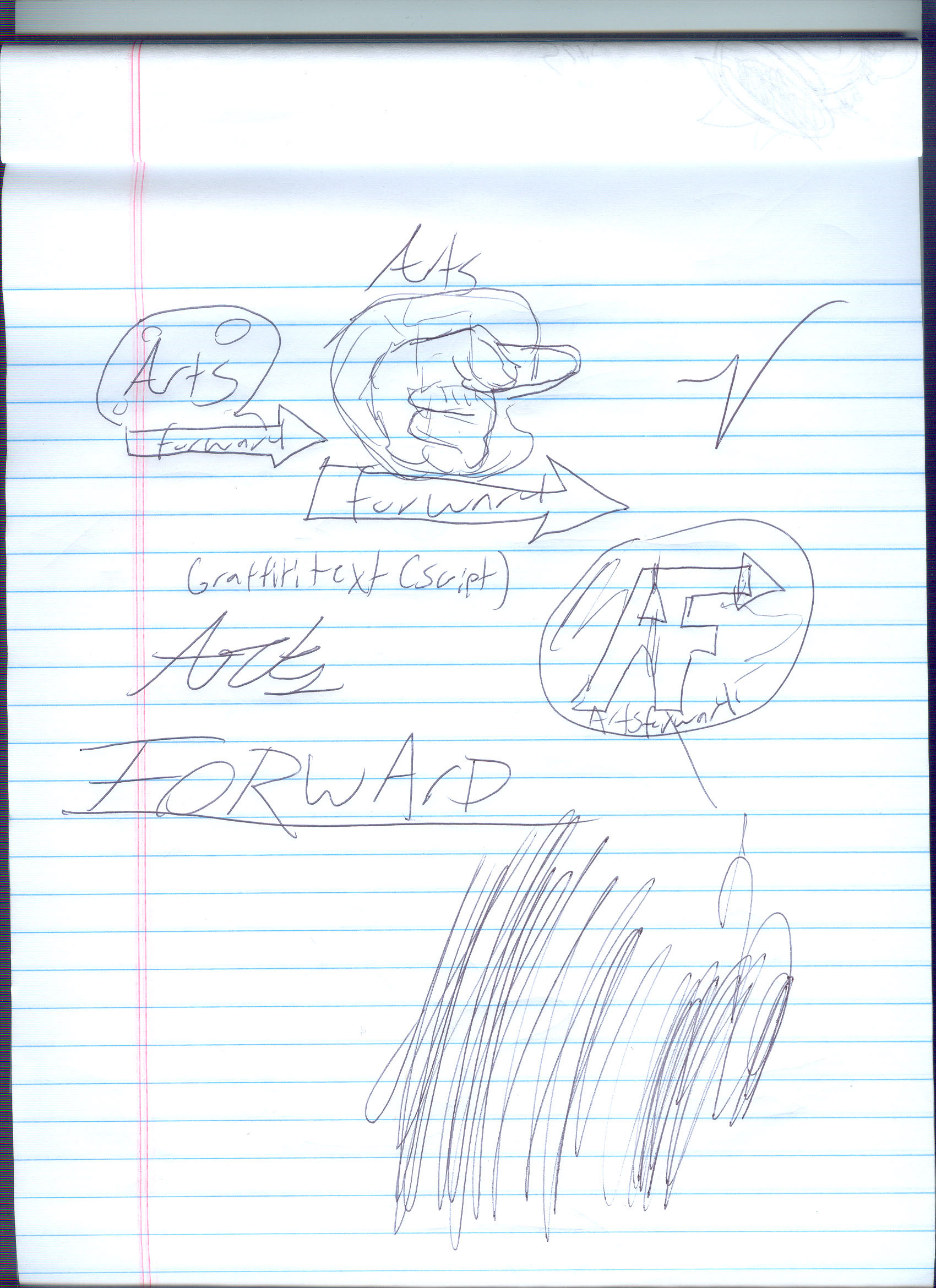
For this assignment, I was tasked with creating a concept for a company known as "Arts forward". The client in question wanted to create a brand in which arts were used to push forward what some consider to be the roots or bottom of society in order to shed light on and fix the issues which plague the inner city. While gleaning info from a phone call, I made a few quick thumbnails. I often compose something in my mind very quickly and with a basis of just a few words. However, sketching and mapping is an integral part of any design process. as it puts that idea to paper and allows for reflection. Design is fun, but you have to do your research and "Eat your vegetables", as my former instructor would say.
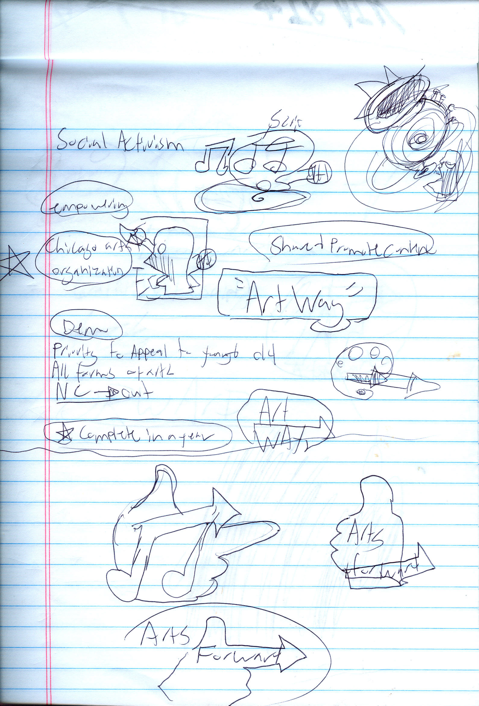
Some more notes and alternate thumbnail concepts. Initially, the company wanted to be called artway, but because of there progressive leanings shifted towards artsforward. I tried to create my thumbnails based on this, using an arrow or pointer finger for "forward".
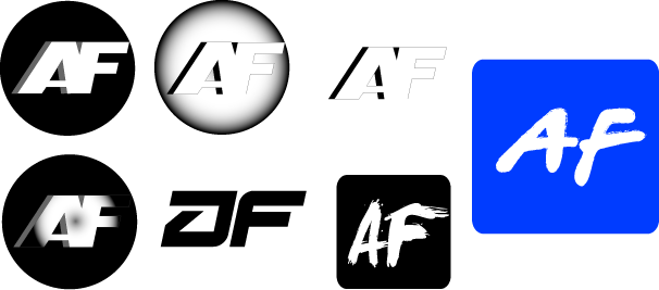
After some initial sketching and internal revisions and communication with the person coordinating this project, I decided to keep my design with the AF monogram
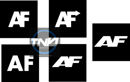
The final four, or five as it were. I wanted to keep the AF for arts-forward, but use it more as a symbol. This was achieved with the monogram composition for the logo as well as the use of the arrow. The client wanted an app, so I insured that all or at least almost all designs were flat, simple, and "clickable". I used flat fonts for this reason. I had my apprehensions with using the arrow at first, as it could look like a gun or pointing a finger, but ultimately, I went with it.
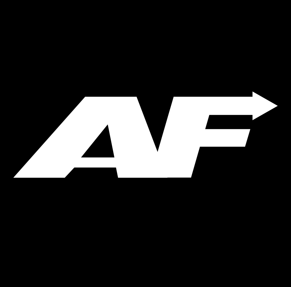
The final concept. I kept my imagery flat and simple, combining from what I believed to be the most successful concepts. As stated, I was previously wary of the possible symbolic problems with the combined arrow and F, but it doesvisually literalize the meaning of 'forward' quite a bit, and is reminiscent of a TV network logo, something that I think is a mark of a visually successful multimedia brand image.